/cdn.vox-cdn.com/uploads/chorus_image/image/68782948/vpavic_4278_20201030_0206.0.jpg)
When my colleague Andrew Webster reviewed the PlayStation 5, he explained how Sony’s next-generation of video games is something you can’t see — you have to touch. Part of that is how the amazing DualSense controller’s clever motorized triggers and intensely precise vibrations can recreate the crunching sensation of strutting across a sandy beach or the pitter-patter of rain.
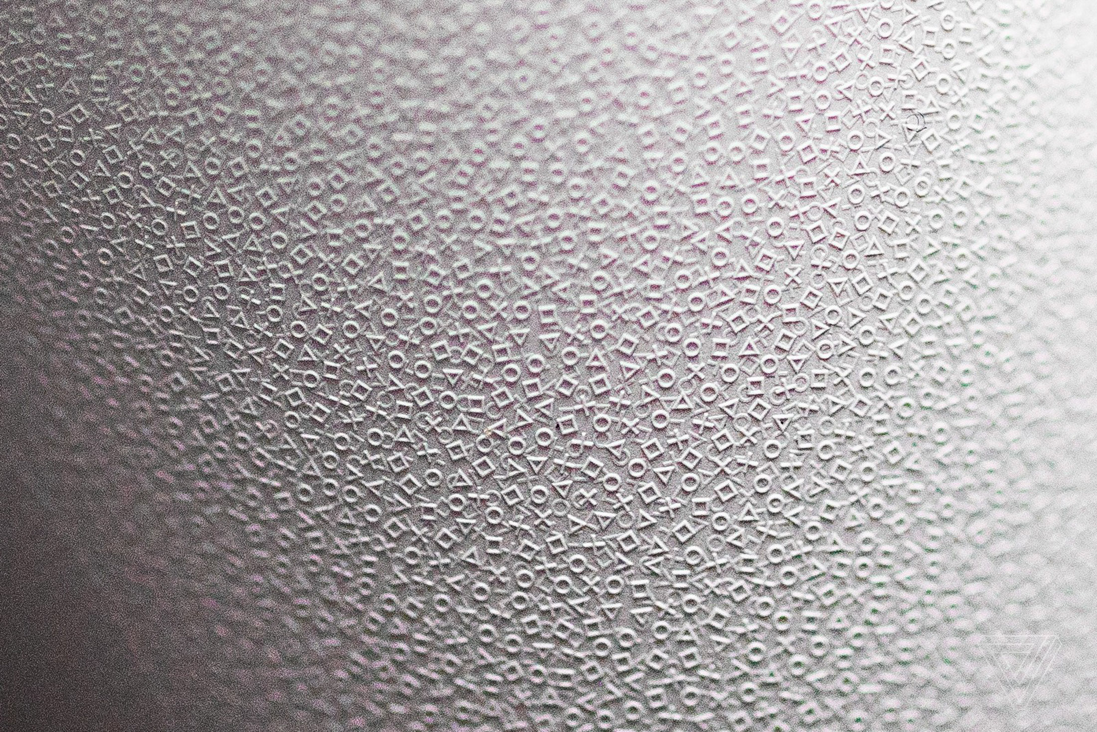
Another part: the 40,000 tiny PlayStation symbols you’ll feel when you pick up the PS5’s new gamepad. As an Easter egg for its fans, the company decided to apply a microtexture to the DualSense controller’s entire lower shell that makes it Sony’s most grippable gamepad yet, because of the thousands upon thousands of tiny squares, triangles, circles and crosses literally at your fingertips.
Sony hasn’t previously spoken about how it did this, how many there are, or how large the symbols actually get, but we have those answers today — including behind-the-scenes photos and details from Sony’s Yujin Morisawa and Takeshi Igarashi, the chief designers behind the PS5 and the DualSense respectively. (We even borrowed a fancy industrial microscope so you can see how the symbols look up close.)
Perhaps the most striking part, as you’ll see in images above and below: these tiny symbols are stacked on top of each other, jutting out in three dimensions. They’re not a single, evenly-spaced layer at all, like the tiny dots you might remember on Sony’s DualShock 4 from 2013. They look random, almost organic — which might be because the entire design was sketched out by hand.
:no_upscale()/cdn.vox-cdn.com/uploads/chorus_asset/file/22286810/1.___________.jpg)
And not just one sketch. Morisawa, the Senior Art Director of Sony’s Design Center Product Design Group, explains that a variety of designs were hand-crafted, digitized, mocked up, applied to actual prototype gamepads, and tested over and over again until the teams found the balance they wanted: good-looking, textured enough to be comfortable and non-slip, but not so sandpaper-rough that it’d hurt your hands over a lengthy gaming session.
While designers could easily place the digital version of the texture wherever they wanted in Sony’s CAD programs, Morisawa says that physically comparing and testing different prototypes was key: “While it takes a considerable amount of time to create a prototype, the ‘go/no-go’ judgment of a product is determined the moment you see it and touch it,” he told us by email.
:no_upscale()/cdn.vox-cdn.com/uploads/chorus_asset/file/22287251/5._________.jpg)
Figuring out the proper heights of the symbols was a lot of work all by itself, as you can see in some of Sony’s behind-the-scenes photos. In the end, they settled on two layers — one roughly 15 microns tall, and another 30 microns tall, according to measurements we made with a Nikon LV100 microscope.
:no_upscale()/cdn.vox-cdn.com/uploads/chorus_asset/file/22286775/20210203_Sean_Hollister_Verge_5.jpg)
:no_upscale()/cdn.vox-cdn.com/uploads/chorus_asset/file/22286782/20210203_Sean_Hollister_Verge_6.jpg)
Actually applying the symbols to the DualSense gamepad was the easy part — because they’re not applied at all. Each and every one of those 40,000 symbols is part of the controller’s shell, created when beads of molten ABS plastic are squeezed into tiny laser-cut crevices during the standard injection-molding process.
The trick is having the right equipment to make that mold. To create such precise shapes across an entire three-dimensional curved surface, meant to fit into your palms, lasers came in handy. Specifically, a high-end, multi-axis laser engraving machine that Igarashi says is “hard to come by.” The upshot? Because it’s part of the mold, the texture you’ll feel on the PS5’s controller is the same exact one every other owner will.
:no_upscale()/cdn.vox-cdn.com/uploads/chorus_asset/file/22286790/3D_CAD____.jpg)
:no_upscale()/cdn.vox-cdn.com/uploads/chorus_asset/file/22286789/___________________.jpg)
Sony’s PlayStation controller has arguably defined decades of gamepads, so it was no surprise when, for instance, Google’s Stadia Controller came with the same kind of stippled texture that Sony introduced with the DualShock 4 in 2013. But this time around, Sony’s microtexture isn’t just for your hands; the barely-there PlayStation symbols are part of the PS5 experience wherever you’d think to look. You’ll find them on both of the PS5 console’s side panels, on the inner lip. They adorn the grips of the PS5’s optional media remote, the DualSense charging station, the PS5 camera, and Sony’s Pulse 3D wireless headset, too.
They even appear inside at least one game: Astro’s Playroom, the must-play PS5 pack-in, prominently uses the texture on a number of floors and walls. It makes sense. Not only is Astro a celebration of the company’s history in gaming, it’s chock-full of PlayStation easter eggs including a few that poke good-natured fun at Sony itself.
In the PS3 era, Sony often felt arrogant, a little too sure fans would lap up whatever it had to offer — $599 consoles featuring giant enemy crabs, proprietary discs and memory sticks for its ambitious portables, a Smash Bros. competitor without enough beloved video game franchises to back it up — but PlayStation has not only earned loads of goodwill since then, it’s become more self-aware. If the company can stay that way throughout the PS5’s lifecycle (and, you know, let people actually buy one), I have little doubt it’ll be a winner.
:no_upscale()/cdn.vox-cdn.com/uploads/chorus_asset/file/22015306/vpavic_4278_20201030_0292.jpg)
https://ift.tt/3oZqReW
Technology
Bagikan Berita Ini


0 Response to "How Sony’s PS5 designers turned PlayStation into something you can feel - Circuit Breaker"
Post a Comment